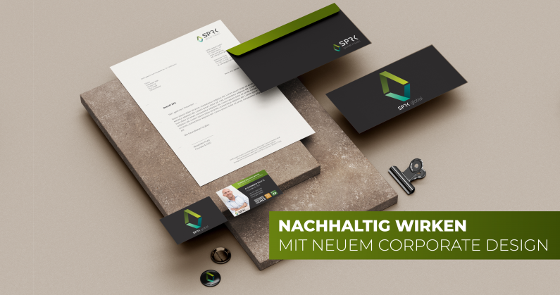
A good corporate design says more than a thousand words. As communication experts, we transmit messages both through conceptual PR and through a strategically thought-out appearance for a professional corporate identity (CI).
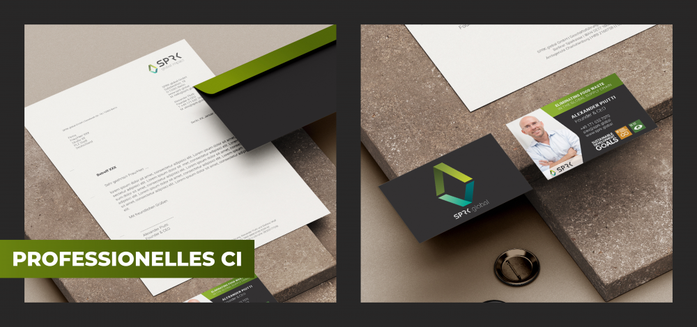
A confident appearance in the corporate image of a company is fundamentally important for its external image. We capture the essence of a company and make it visible. Whether on the website, presentations, social media, business cards or the product. We offer partners design support – we rework existing CI or start from scratch.
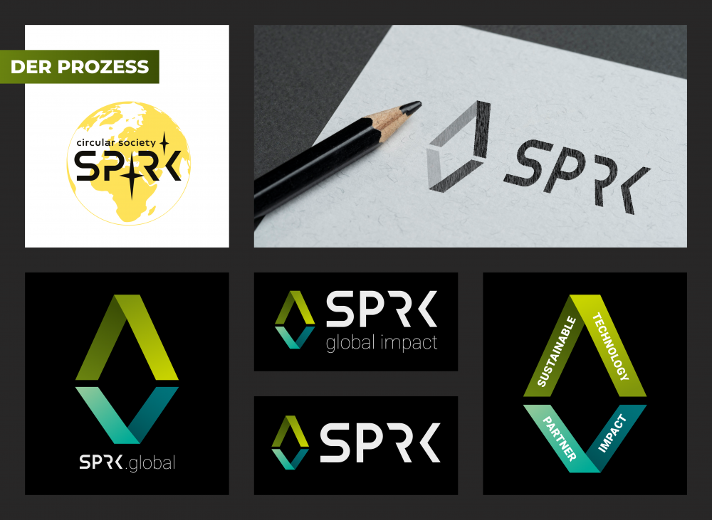
In the process of redesigning SPRK, the previous corporate design was rethought and its content focused on the four most important keywords of the start-up: Sustainable, Technology, Partner and Impact. The goal of SPRK.global is to use AI-based distribution technology to systematically redistribute and reduce food surpluses, which occur primarily at the beginning and in the middle of the supply chain, in a spirit of partnership. This protects resources and the climate. Through the redistribution as well as the transformation of surplus but perfectly edible food into new, durable products or meals, the food cycle closes. This essence of a circular economy for the food sector is reflected in the “circle” represented by the four keywords.The created color concept, which represents the color spectrum from dark to light green via blue to turquoise in a progression, reflects the values of SPRK.
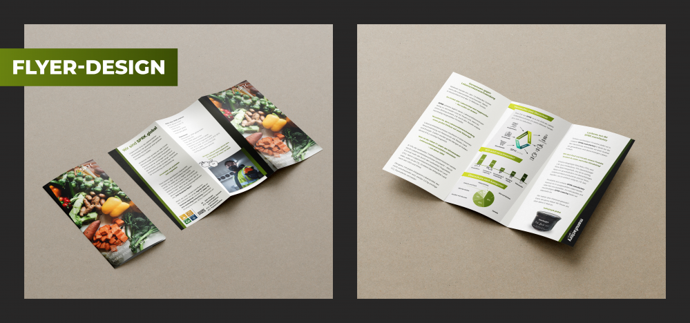
In addition to the logo, we designed a foldable flyer to present the company’s philosophy, mission and structure at a glance. Current figures, data and facts – suitably prepared – complement the qualitative statements with provable information.
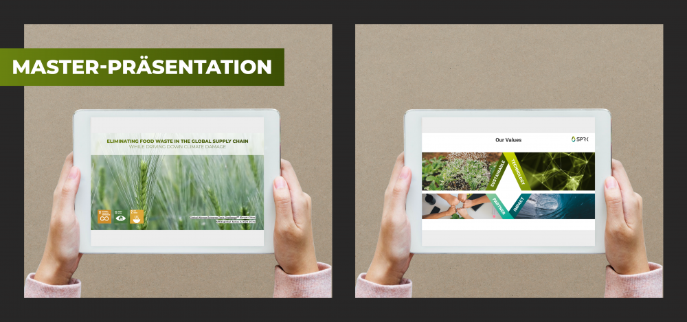
In order to inspire customers and partners about the company, a master presentation was created that can serve as a template for future customer pitches or support internal communication as well. Each slide reflects the CI through its color schemes, design elements and graphics and again underlines SPRK’s philosophy and vision.
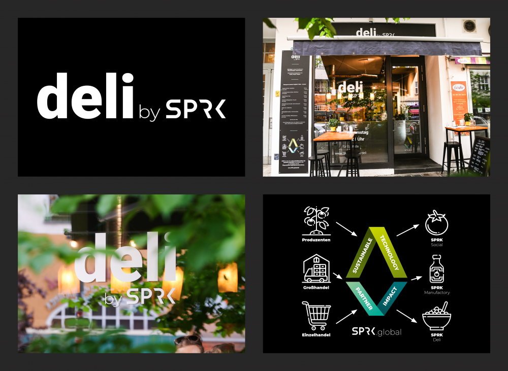
One component of the corporate concept and the brand “SPRK” is the restaurant “deli by SPRK”, which offers surplus food as well as in-house products in a modern food concept. The SPRK deli exudes once again the company’s vision of not wasting food and, as an eye-catcher, also invites passers-by to take a look and satisfy their small or large appetite. Again, the new corporate design of the logo as well as the colors, graphics and icons are crucial core elements to reflect the restaurant’s overall corporate identity.
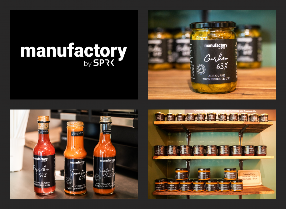
With SPRK.manufactory, the start-up also offers products prepared from surplus. Sauces as well as pickled specialties now have a uniform look and feel. A delicate handwriting displays the product names. The black and white design of the labels is set in a timelessly beautiful contrast by the bright colors of tomato, cucumber and co.
